Google off-late has been experimenting with new user interfaces in many of its products to give better user experience. Some of them are well received by the audience but few has brought outrage.
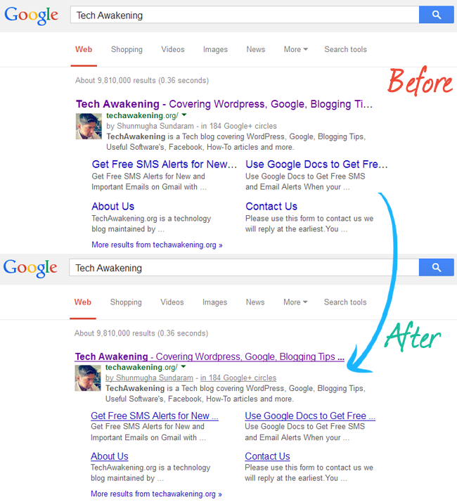
One such change was that of Google search result page redesign. If you are a regular user you would have noticed big differences which includes larger font size and hyperlinks without underlines.
Like many other users, I wasn’t comfortable with this change in-fact was experiencing headache whenever I looked into the result and was unable to distinguish one result from another.
Initially few users had thought it was their browser/system that was causing this problem and tried system restore, uninstalling add-ons, clearing cache but in vain. None of this is going to help since it’s an official design change made by Google.
Google Old Search UI – Bookmarklet
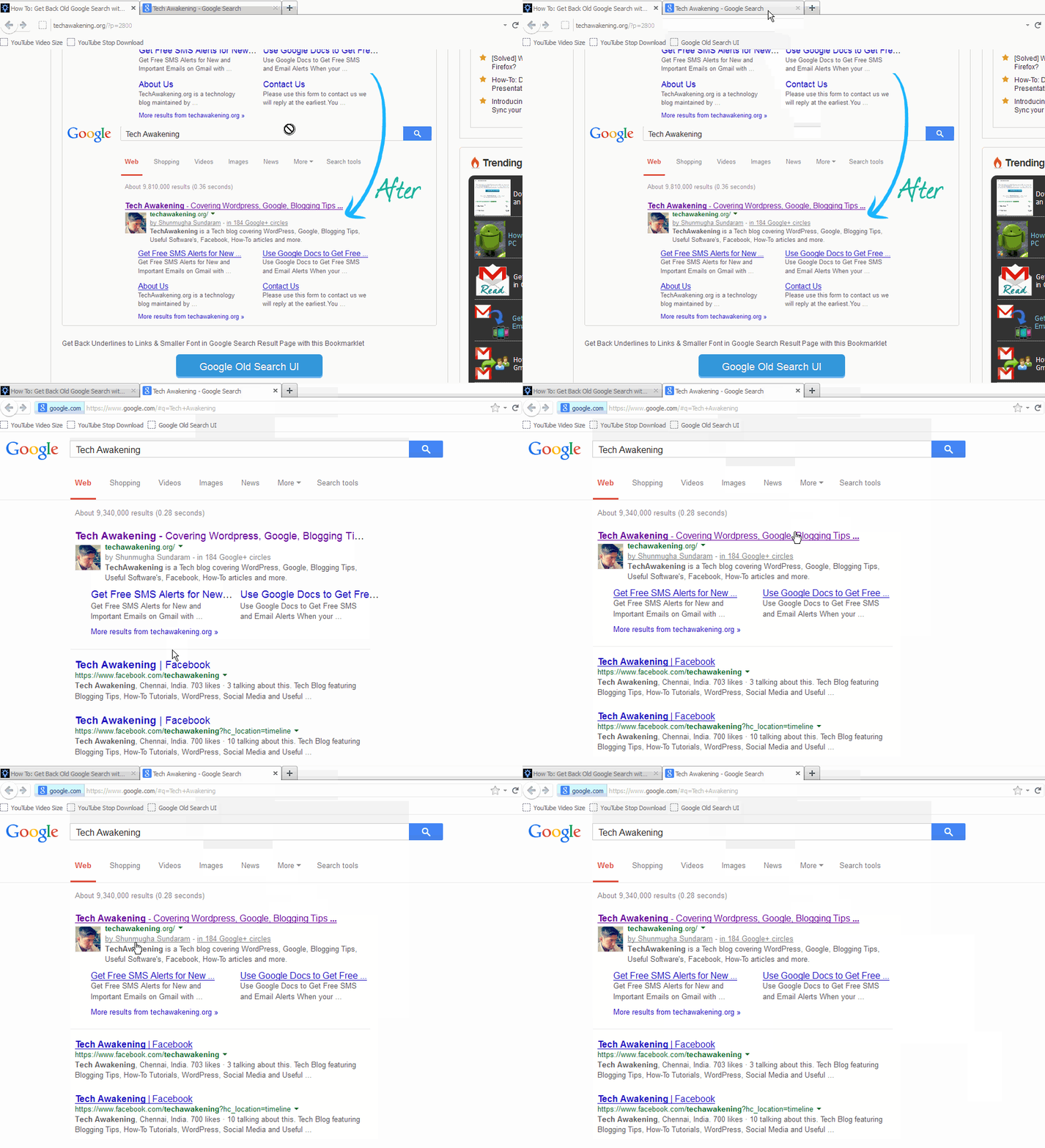
There are already some workarounds to fix this by installing add-ons. But if you want a simpler solution which works regardless of any browser, meet Google Old Search bookmarklet which lets you get back underlines to links & smaller font size in Google search result page which are ease on eyes.
Installation and Usage Instruction:
1. Drag, drop below bookmark(big blue button) to your favorite browser’s bookmark bar.
2. Type-in your query and search as usual.

3. In results page click on the bookmark you just made and wait for few seconds. You will notice change to look and feel which you were previously used to and comfortable with.
Did it work for you? Wish to add any more customizations to the bookmarklet? Feel free to share your views.
it’s useless…we gotta think like Google…they know best…
Horia,
True. But this workaround is for those who are still uncomfortable with the change 🙂
I am really glad to read this post. Before I used your Gmail sms alert service and its works fine still now. So bro continue this writings for us. My blog TekPip.
Good to know. You are most welcome bro. Keep reading 😉